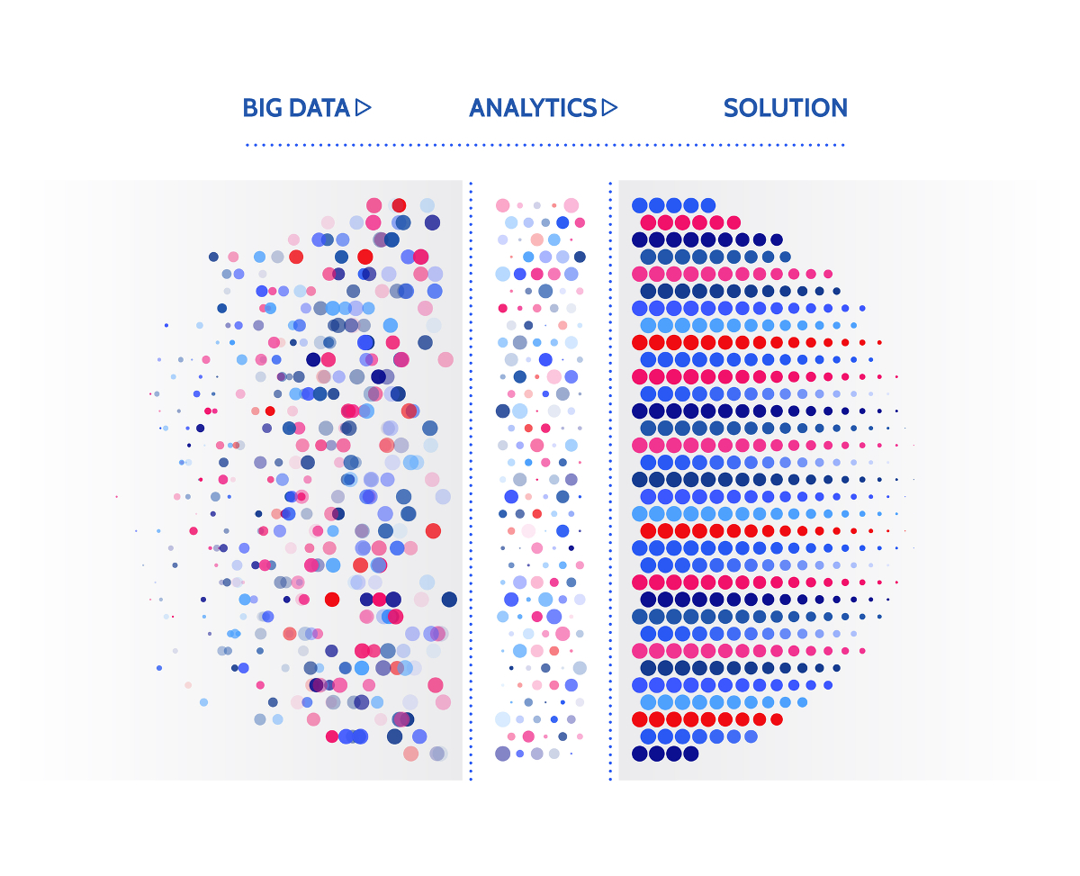
Data visualization is one of the essential parts of good business. You can't make the right decisions without a graphical representation of the vital data you have. Gathering as much information as possible has immense applications in both large corporations and smaller, local businesses.
When you've accumulated big data with a crawler, manual searching, or proxies, you will need to visualize it. One of the most common ways business owners and marketing managers choose to visualize their data is through the use of graphical elements, such as charts, listings, and graphs.
Visualizing your data is going to have quite an impact. When you present a piece of data in graphical form, you can guarantee that your peers, employees, or partners are going to understand it better.
But, choosing an improper color pallet might harm your whole presentation. That is why the color pallet matters so much in data visualization.
Understanding Data Visualization
The world of data visualization plays a significant role in any business. It's a graphical representation of any data accumulated and works to help marketing experts and other workers understand the data more thoroughly. Granted, this is mostly used in the marketing and analysis sector.
When you accumulate data, it's known as raw data. Raw data consists of all the redundancies, essential data, and situational data. It has to be refined to get correct, usable data.
When you're left with usable data, taking it a step further with data visualization is going to allow your employees to understand it thoroughly, and use it to monitor particular trends, recurring patterns, etc.
Data without analysis is virtually useless. Proper analysis is going to refine the data from random numbers to a usable tool in any marketing, optimization, and tracking strategy.
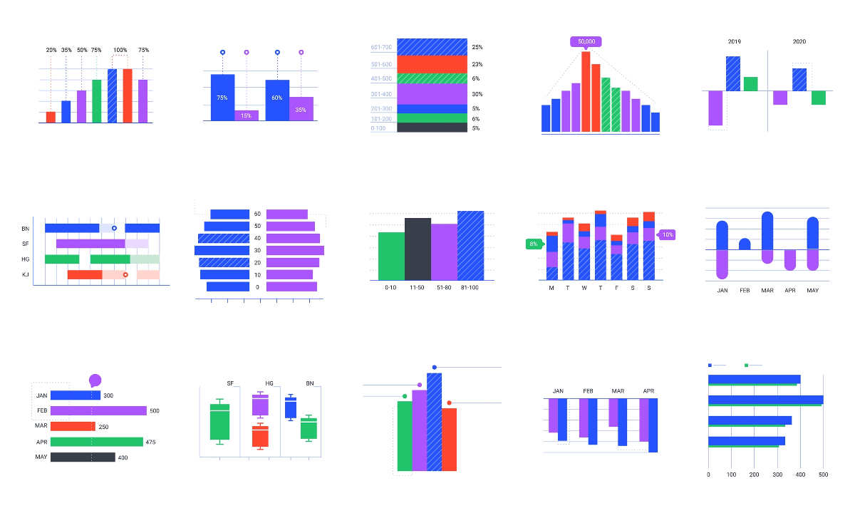
The Forms of Data Visualization
This methodology extends to a multitude of types, such as:
- Charts
- Maps
- Graphs
- Statistics
- Columns
- Plots
- Points
All of these are frequently used in the world of data visualization, and all have a different application. Different types of data visualization are best suited to various companies, the kind of data they're representing, and the amount of data itself. A particular type will help you present the information in a specific way.
Colors in Data Visualization
When you're making a graphical visualization of a piece of data, your top priority is to make it suitable for the user. In this case, you're going to want to use all the visual elements at your disposal if you're looking to make a reliable, usable graphical visualization of your data.
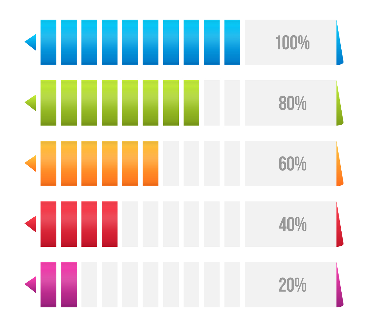
One of the most critical things in design is the color pallet that you use to represent your data. The colors have a whole science behind them, and using different colors to paint different pieces of data is integral in the data visualization process.
The proper choice of colors will allow you to guide the viewer through the data visualization representation. It will enable you to make particular things stand out, effectively leaving you in charge of the data interpretation.
Picking proper colors for the job is essential, but the issue with this is that there are no preset rules for choosing colors. The color pallet is going to depend on you, your business dealings, and, most importantly, the type of data you're trying to represent.
Data Comparison Through Color, Depth, and Shape
When you're making a comparison between two things, it's crucial to pick contrasting colors. The amount of data that you attempt to portray is also significant. The best way to go around this is to use a gradient.
Using gradients in your colors will allow you to paint a long piece of data that shows progress, regress, and fluidity. The more complex the data that you're trying to represent, the more complex the color scheme of the visual data representation.
If you're trying to make a comparison between two pieces of conflicting or contrasting data, you're going to have to be smart with your colors if you want to make it stand out. Gradients are going to take you so far, but when there is an abundance of data to represent, it could get quite confusing.
That is why you should work to minimize the amount of data that you're trying to describe while maintaining the same point.
Don't attempt to stick everything within one representation. The more data that you decide to include within a data visualization, the more complicated it gets, and the clarity will drop significantly.
Splitting your data among different types in different visualizations is as vital as adequately coloring it. If you're doing a sole presentation that consists of multiple ways of data visualization, make sure to stick to your original color pallet as much as possible.
Another essential part of data visualization is to make sure you're not only consistent but concise. Make sure that your comparisons and presentations stay distinctive, one from another. That is best done by utilizing contrasting colors, shapes, and sizes.
Different Colors and Their Meaning
It's no secret that colors are a science of their own. Utilizing a data visualization color picker is only going to take you so far, and before you get into the colors, you have to understand what they mean. This is color symbolism. Below are the most popular colors used in data visualization and their subsequent meaning.
Red
This color is associated with energy, drama, assertiveness, attention, and urgency.
Blue
This color is associated with calmness, security, trust, and importance.
Green
This color is associated with harmony, stability, progress, and acceptance.
Yellow
This color is associated with relaxation, opportunity, decisions, and positivity.
Purple
This color is associated with luxury, success, and spirituality.
Pink
This color is associated with creativity, motivation, and energy.
Orange
This color is associated with fascination, attention, and uncertainty.
Gray
This color is associated with formality, assertiveness, uniformity, and descriptiveness.
Black
This color is associated with authority, discipline, and control.
In Conclusion
Data visualization is a quintessential example of good marketing, optimization, and progress. Picking out the best colors for your visual representation of data is as simple as following the rules mentioned earlier.
If you're looking to make the whole process that much more comfortable, plenty of programs include data visualization color pickers. These will help you make sure that all of your colors are on point and will help you represent your data correctly.
The data visualization color picker also allows you to create custom colors that will personalize the way that you represent your data, thus making it seem more professional.