
Do you know that people, things, and organizations generate 2.5 quintillion bytes of data every day? It's a mind-boggling figure, but it helps businesses to analyze customers and find new and improved ways to grow revenue in the long run.
Professionals all over the globe often use data visualization techniques to simplify and present the results of statistical analyses. It's a super-useful process that earns businesses a whole set of practical benefits such as:
- The ability to understand relations between actions and consequences.
- The potential to communicate analytical findings in a meaningful manner.
- The chance to act faster and make data-driven decisions.
- The power to identify emerging trends.
Although the advantages of data visualization are evident, the process itself does not come without a few disadvantages. In this post, we will point out seven data visualization pitfalls and how to avoid them.
Data Visualization Definition and Stats
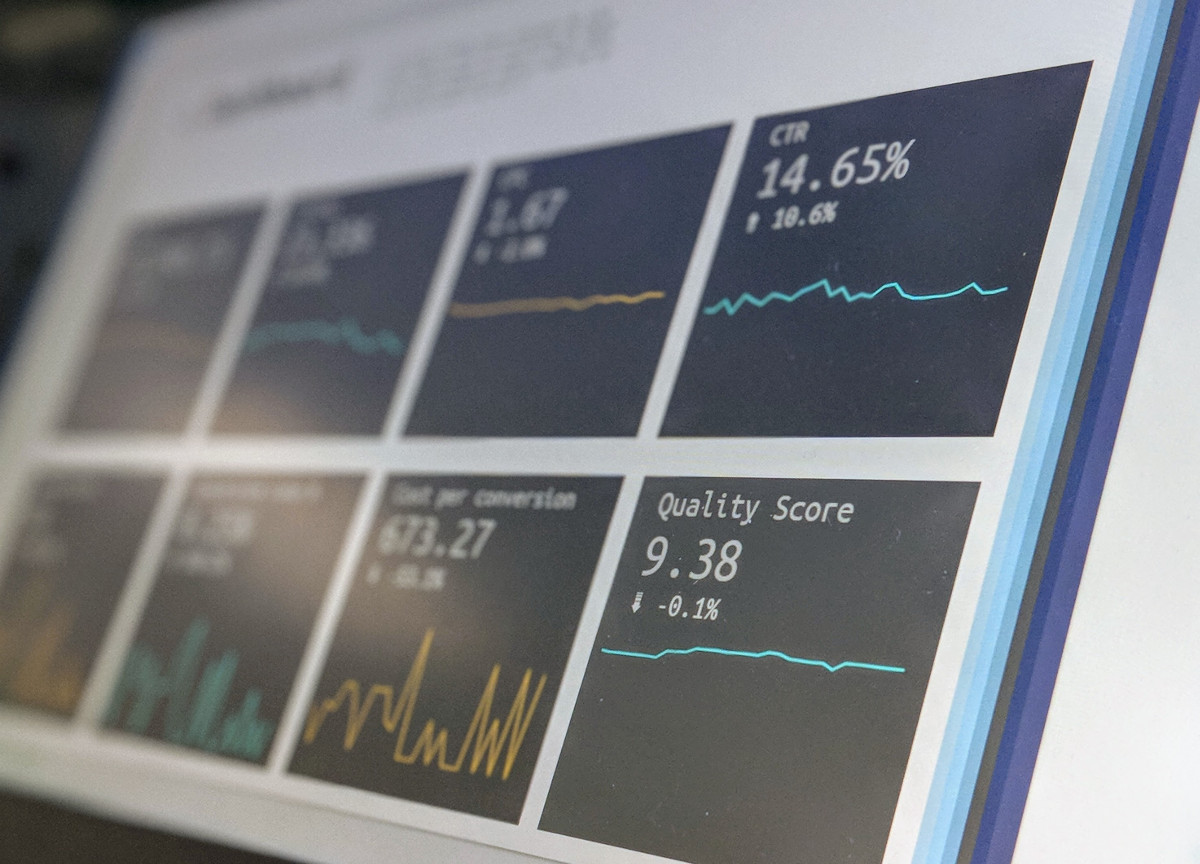
What is data visualization? By definition, it represents a general term that describes any effort to help people understand the significance of data by placing it in a visual context. To put it simply, data visualization reveals correlations and schemes that frequently get overlooked in traditional text-based analysis.
The most common data visualization types include the following:
- Frequency distributions
- Time series
- Nominal comparisons
- Ranking charts
- Correlation maps
- Geospatial maps
- Deviations
- Part-to-whole
Common Data Visualization Traps and Misunderstandings
You've seen enough about data visualization in general, so now it is time to find out more about the frequent data visualization traps and pitfalls. We made a list of seven common issues in this field:
-
Not knowing how to visualize information
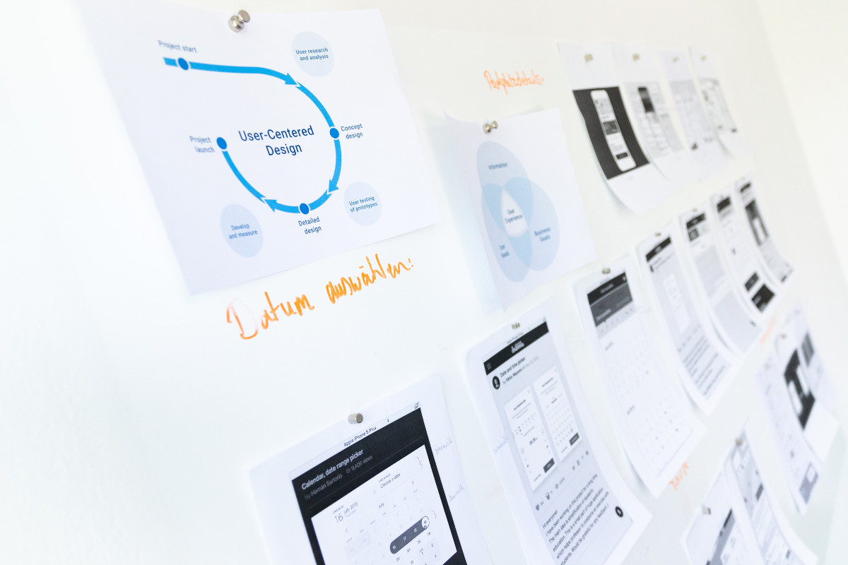
The most common problem is also the simplest. Namely, a lot of business professionals don't know how to visualize information and present it to the audience. This happens mostly because data visualization tools make it easy to create charts or graphics, so people choose a popular template without determining whether it's the best solution for their projects. You can avoid this trap by learning about different types of charts in data visualization.
-
Not providing formal training to employees
This problem goes hand in hand with the previous one. A lot of organizations take data visualization for granted and believe their employees can handle it without any kind of formal training or education. The answer to this issue is relatively simple – companies can design and customize special courses for their workers to ensure the optimal level of knowledge and understanding data visualization-wise.
-
The human limitations of algorithms
Every data science algorithm is based on human inputs, which can be a burden for some project and lead to misinterpretations. Human instructors can be biased and unable to detect the most relevant concepts and points of view. What you can do to prevent it to involve multiple analysts and seriously brainstorm the project before crafting the algorithm.
-
Not created with the audience in mind
You can complete the most beautiful and comprehensive data visualization project, but it won't make a big difference if you fail to align it with the requirements of the target audience. You have to be aware of their data interpretation skills and design the presentation so as to fit their level of skills and knowledge about data. This is the only way to make the desired impression on your clients.
-
Oversimplification
If your audience is not too familiar with data visualization techniques, you might fall into the trap of oversimplification. Doing so, you will fail to present the right information and completely miss the point of the research.
For example, it's a common issue when somebody wants to explain to potential clients why they need an assignment writing help. They are usually talking to young students, so they oversimplify graphs and charts to make things easier to figure out. Your job is to prevent it by showing the right information at the right moment.
-
Paying too much attention to form
Data visualization is all about visual components, so it's natural to focus on making the final document as beautiful and attractive as possible. However, you should not let it distort your logic and influence decision-making. On the contrary, you have to make a balance between professional insights and aesthetics if you want to maximize the effect of data visualization on your audience.
-
Over-relying on visuals
Data visualization is probably the best method of presenting information clearly and meaningfully, but sometimes it's not enough to use visual components exclusively. You need to know when to add a small portion of textual content to the presentation to supplement statistical findings. Don't consider it to be a flaw. It is quite the opposite because over-relying on visuals could make the presentation blurry or even pointless.
Conclusion
Data visualization is a powerful information management technique that can help you and your team to work faster, better, and more efficiently. But visualizing data is not as simple as it may seem at first, so it comes with a fair share of possible issues and shortcomings.
In this article, we analyzed seven data visualization pitfalls and gave you practical tips on how to avoid them. Have you ever made one of these data visualization blunders? Do you have other important suggestions to share with our readers? Make sure to write a comment – we are looking forward to hearing about some first-hand data visualization experiences!