You know how Apple always make their laptops look so sexy? It’s part design, part marketing – and the marketing can have a huge influence. Minimal product advertising is not just about providing the user with some tasty eye-candy, it’s about having faith in your product to the degree that you can let it stand alone. In this article, we’ll create an eye-catching minimal poster to advertise a new range of ultrabooks.
These are the dimensions and settings I’m using for the Photoshop document
First up, we need to decide our unique selling point. Since we’re using ultrabooks, it makes sense to emphasise their lightness and portability. To that end, we’re going to select colors, typography and images that naturally fall in line with that theme. Above are the dimensions I’m using for the project.
Here’s how we’ll start
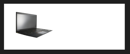
First, we need to find a good stock ultrabook picture. The one I’ve chosen to use is above. As a basic design, I’d like to have the ultrabook floating to the left, with something minimal to demonstrate quite how light it is, and some simple, light typography over to the right. I’ve decided to use a white background, as this emphasizes the bright, lightness of the overall theme. White’s counterpart is black, but we don’t want to introduce the heavy dour tone of #000. To that end, we’ll use a slightly lighter gray to ‘float’ the text off the page.
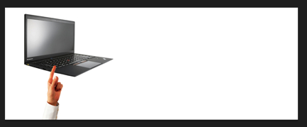
The addition of a human hand softens the whole image, and suggests lightness and balance
With those critical design decisions made, let’s get to work. We want ‘something’ to indicate the lightness of the product on the left hand side. A balloon? It seems too playful. We can add a human element, emphasize the lightness and suggest finely-crafted balance by adding something else. Above is my specific decision. It also adds a little color to the page – but a warm, familiar, non-intrusive color.
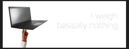
Adding the text will mean we can start to play with curves
Blending the hand under the model is no problem, but we need to adjust the color a bit. To ensure we have the right color balance, we’re going to need to add the text. Picking a medium gray, we’ll add some nice, thin type next to the image. The copy needs to be minimal, too. I’ve chosen Maven Pro as my font, as it’s spindly and light. Some alternatives to try could be Helvetica Neue Ultralight, or Myriad Pro Light. I’ve chosen sans-serif fonts exclusively as the serifs on serif fonts tend to add a ‘weighty’ feeling to them.
To cover the finger with the appropriate shadow, I created a drop shadow on the ultrabook, extended it quite a way from the ultrabook body, created a layer from the Drop Shadow itself (right click on the effect > Create Layer) and cropped the drop shadow layer to the outline of the hand layer.
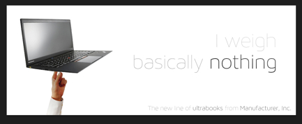
The finished ad
Now that the text is in place, I can play around a little with the typography and curves, to balance the image and make it feel less ‘weighty’. First up, I’ve chosen to alternate between Maven Pro 100 and Maven Pro 200 for the important parts. I’ve also chosen to put the text much darker than originally proposed. This is to offset the effect of adding a white-filled ellipse, Gaussian-blurred, to the top-right of the image. The blurred ellipse has the effect of ‘washing out’ some of the text color, leaving the ‘I weigh’ almost evaporating off the page.
With this in place, I’ve used a curves adjustment layer to bring the shadows up around the hand, giving it a more natural and healthy appearance. Similarly, this has lifted the ultrabook itself (no pun intended), whilst retaining enough contrast that the Maven Pro 100 type is still legible.
From here, I could pop the item in to Adobe Edge Animate and serve it up as a floating HTML5 banner. I could adapt it for print using InDesign, or I could just save it as a PNG and have it as a static file on the web. It’s all unlicensed, so feel free to use the ideas or the image in your next project. Have fun!