There is a lot of misconception in the world as to what constitutes great ‘design’ work. To many people, great design is something that leaps out at you and grabs attention: perhaps a huge image with lots of details and images, or perhaps a website with an elaborate introduction and that manages to use just about every colour in the rainbow.
People presume that this is what makes great design, but they are mistaken. That might be great art (though detail and grandeur are certainly not prerequisites for great art), but it’s not great ‘design’ which is actually something completely different. Great design you see is something that shouldn’t draw attention to itself and that should blend into the background. It’s something that should be elegant and graceful in the way it works, and it’s something that should follow a specific ‘language’ that makes itself accessible.
This is particularly important when it comes to web design. Of course you don’t want the web design to be flamboyant or highly detailed – all that’s going to do is to distract from your content and from the products or services you are trying to sell. And at the same time you need to ensure that you aren’t chasing style over substance and making your site unnecessarily difficult to navigate and understand.
More than ever then, web design makes it important that your design doesn’t draw attention to itself, and that it serves your site first and foremost. This means it should go almost unnoticed by the user and in turn that means that it should be intuitive for the user. So how do you make a web design that’s so intuitive and instinctive that your visitors know precisely where to click and how to find what they want as soon as they land on one of your pages? Read on to find out…
Follow Conventions

One way to make a web design intuitive is to follow the design language already set out by other webmasters and bloggers. Most of us will interact with hundreds of websites a day, and many of those are very similar. This then means that users will be used to reaching for particular parts of the site when they need particular things. Want to return to the homepage? Chances are that the link is going to be on the top menu on the far left – just as it always is.
The great thing about this is, that it allows you to play with other aspects of the site and with other expectations. As long as you follow these expectations and put these links where they ‘should be’, then you can allow your design to deviate and get more creative in other ways.
Skeuomorphs
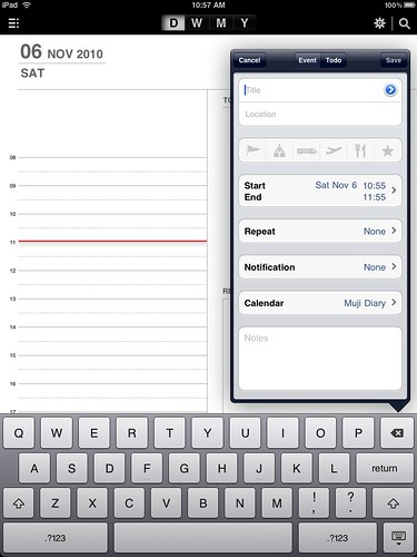
If you don’t know what a skeuomorph is then don’t worry – after all it’s a pretty weird word that doesn’t exactly come up in conversation often. Essentially a skeuomorph is a design that’s based on something real that we’re used to using. So for instance take your typical calendar app. Most will have ‘pages’ for each month of the year and will allow you to ‘turn’ those pages by clicking on the right. This isn’t necessarily the most logical or efficient way to display a calendar on a computer though of course: it would make more sense if we saw only the days ahead rather than having the screen filled up with days in the past when we got to the end of the month – but it works because it’s what people are used to making it at once comforting and familiar. If you can base your site around something people already interact with, then you can get more original and people will still understand intuitively how to use it.
Communicate Don’t Decorate

This is a maxim that many designers follow, and it essentially means that you shouldn’t include any element just because it ‘looks nice’. In a good web design, everything you include on the page should serve some kind of important purpose and that will then mean that your visitors aren’t distracted by unnecessary embellishments and will be guided to where to click by every single item on your pages.
Follow these rules and you can create a site that’s brand new and as creative as you like, but that people will already know how to use.