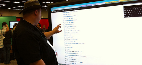
Photo by Sebastian Bergmann
Microsoft’s focus on touch input with Windows 8 has sparked many discussions about the differences in design for touch-based user interfaces and those navigated with the mouse. If you’re developing an app or a website, chances are you’re wondering if it’s mainly going to be used on devices with touchscreens, such as smartphones and tablets, or also on desktops and laptops. Many articles can be found online that explain how to design for touchscreen, but none of them explain whether you should. In some cases this decision is easy – if you’re lost, you’re more likely to look at your phone for directions than to take your laptop from your bag – but in other cases it’s not. Will people play your browser game on their tablet or on their notebook? Is your business calendar going to be used in the back of a cab or in the office? Often, it’s hard to predict, and the emergence of hybrid PCs that come with both touchscreens and keyboards adds yet another dimension to this problem.
The trick is to aim for accessibility from any device. The first tip is simple, obvious, and the main point of criticism on Windows 8: avoid horizontal scrolling. As many other articles will tell you, there is a reason that most websites have a vertical orientation, and that’s the scroll wheel on the mouse. On a touchscreen, of course, this isn’t an issue at all. Many web developers see this as a chance to be innovative with page layout and orientation, but when it comes to usability, there’s absolutely nothing to lose by choosing a vertical layout.
Link placement works exactly the other way around. Every area on the screen is easy to reach with a mouse, but the comfortable movement for the right-hand thumb – used most to navigate on smartphones – is limited to the bottom-left corner of the screen. And on tablets, this all depends on the way you’re holding it, and since tablets are used in so many different contexts, there is not one standard. The answer is responsive web design. This is already a well-known principle to make websites legible and layout page elements so they’re visible on different screen sizes, but can also be used for completely fluid web designs that adapt link placement and size of all separate elements. The greatest advantage of responsive web design is that it’s very easy to implement. There is no need for server-side coding; all the information is contained in a few lines of CSS code that is understood by all modern browsers. With the “@media” rule, you can change the style based on the detected screen size, and for example change the font size, image size, and the location of navigation elements.
Some other things to keep in mind are that the pixel-sized mouse is a lot more accurate than thick, clumsy fingers, which influences the suitable size and spacing of buttons. Also, touchscreens don’t usually support “hover” functions like drop-down menus, but do have options for multi-touch like scrolling and pinching – options that are found in some laptop touchpads, but definitely not on a mouse. The fact is that although touchscreens are ubiquitous, a lot of work is still performed on laptops, desktops, netbooks, and ultrabooks: all with mice or touchpads and keyboards. So unless your app is very clearly aimed at mobile users, it’s better to design an interface that works just as well on the small touchscreen of a smartphone as on the 17″ monitor of a traditional PC.
